Overview
TOM's Shed v2 was a Capstone Project a part of my final year at University. This project involved re-designing and upscaling my Dads hobby of brewing beer. I had previously designed a logo for him as TOM's Shed v1 which you can view here. This project involved creating a new brand identity, creating labels for beer cans and merchandise. A website was designed as well as a base for the whole brand.
Aims
Working with the client (my dad) to provide an identity and values that support the brand.
Create an appealing brand that can crack in to and stand out in a very competitive market.
Background
The Client
Don Robertson is a retired traffic engineer, who, in his retirement has become quite the brewer, he brews a wide variety of craft beers which he likes to give to his mates, in which he has had many positive reviews of his various brews.
The Scope
Initial discussions with Don involved him wanting to upscale his brewing to become more commercial and these deliverables were laid out.
Branding:
Combination Mark Logo
Beer Can Design
Style Guide 2-4 pages
Web:
Website Landing Page
Time Permitting:
T-Shirt Design
Hat Design
Bottle Opener
Constraints
Because the project was a university project, some constraints already existed and then further constraints laid out whilst in discussion with the client:
12 week timeline.
Compete against strong competition and designing to stand out.
Design for a diverse target audience to appeal to all kinds of beer drinkers.
Research
Target Audience
For target audience, craft beer designs don’t set out to have gender specific designs, rather they have inclusive designs that do not discriminate. The focus was on avid craft beer drinkers who enjoy trying out a wide variety of different flavours of beers. The age is only restricted to 18+ for legal reasons, but will not be targeted to a certain age demographic above 18, but to include all ages.
Competition
There are plenty of craft breweries in Melbourne, and along with that, plenty of different beer varieties, therefore distinguishing one’s self from another can prove quite a challenge without going so different that users would not bother giving your brewery a try. From a design perspective it is important to understand what works well from other businesses design and implement them in to my clients own brand style.
Being based is South-East Melbourne, the most notable competition are:
Stomping Ground Brewing Co
Bad Shepherd Brewing Co
2 Brothers Brewery
Wolf of the Willows
Goals
Deliver a beer brand. Creating a style that pleases the client is the main objective, committing to researching the style don wants and making mood board that reflect this style, and ultimately designing a logo, and mock ups for can’s, bottles, packaging and time allowing, some merchandise to sell.
Build a functional website, with the aim of getting users to buy merch, beer packs or book a table. In order for this to be done effectively, research will need to take place on other websites that effectively communicate this style and design the website to reflect the style of the brand and is easy for the user to understand.
Ideation
A rigorous process of designing a new logo was undertaken. The original design I created in 2019 it worked at the time as a basic logo for a couple of mates with a hobby. In order for the brand to expand and compete with these craft breweries, a new logo had to be created, something that gave the brand some character and colour, whilst still keeping the same character of a woodworking factory and craft brewery place.

Original 2019 Logo

Re-designed logo
New Design
Unfortunately I do not have the sketches of the development of this logo. I wanted to retain the idea of a timber workshop with the use of a saw, whilst providing some contrast that puts the beer as the main centrepiece. Removed the est. as it was unnecessary for a fairly new brand to have, instead opting for where its made. The logo is synonymous with other beer brands with the use of an emblem yet remains unique to its own brand. Made in Somers is in reference to where the beer is now being brewed, down where Don lives down the Mornington Peninsula in a small beach town called Somers.
Illustrating Labels
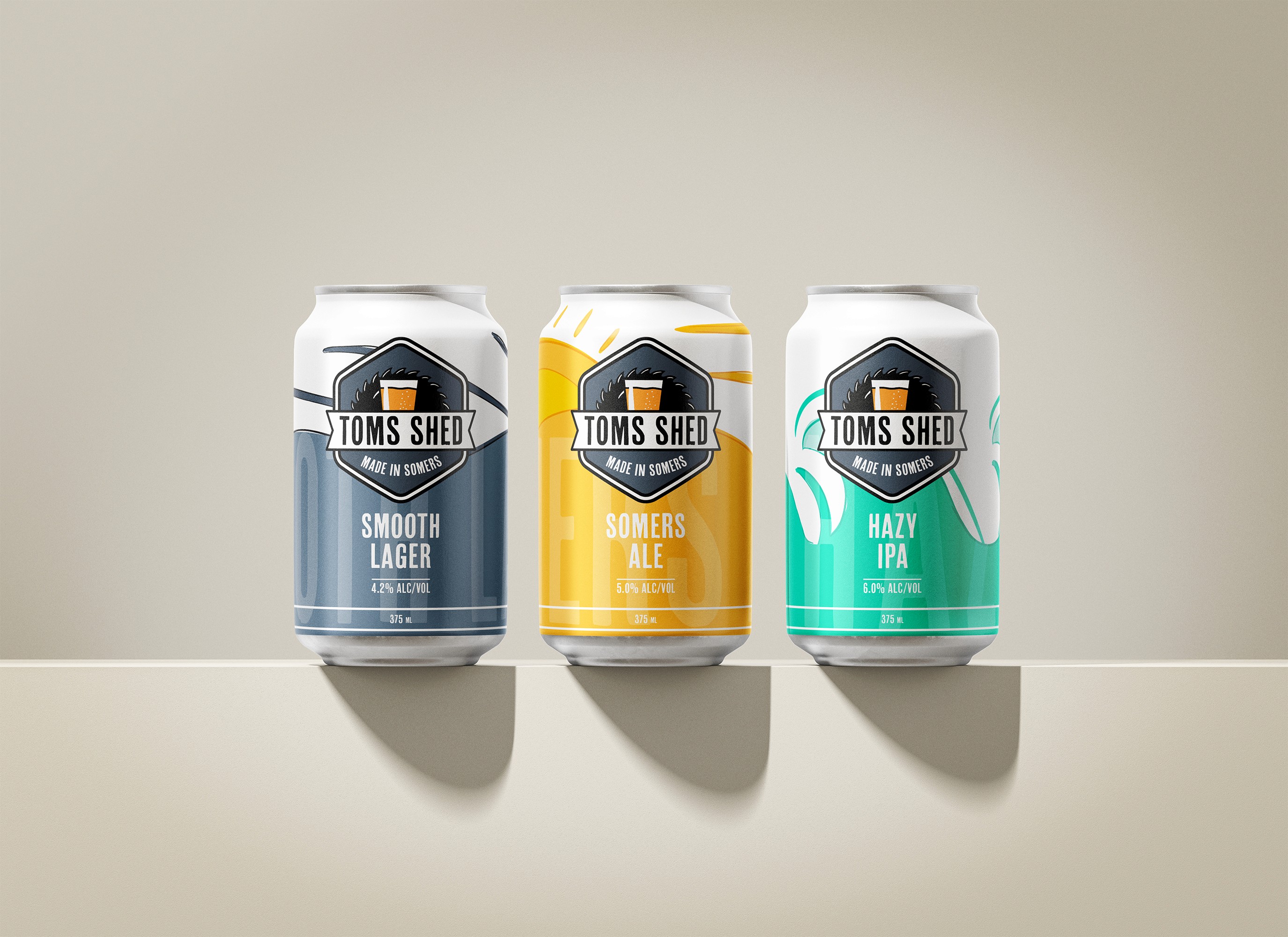
When the re-design of the logo was complete, it was now time to create the beer can artwork. I settled for 3 different styles of beer which would have different illustrations to one another. The naming of each style were: Smooth Lager, Somers Ale and Hazy IPA. I wanted each to be a recogniseable name and references back to the beach where Somers is located.

Smooth Lager

Somers Ale
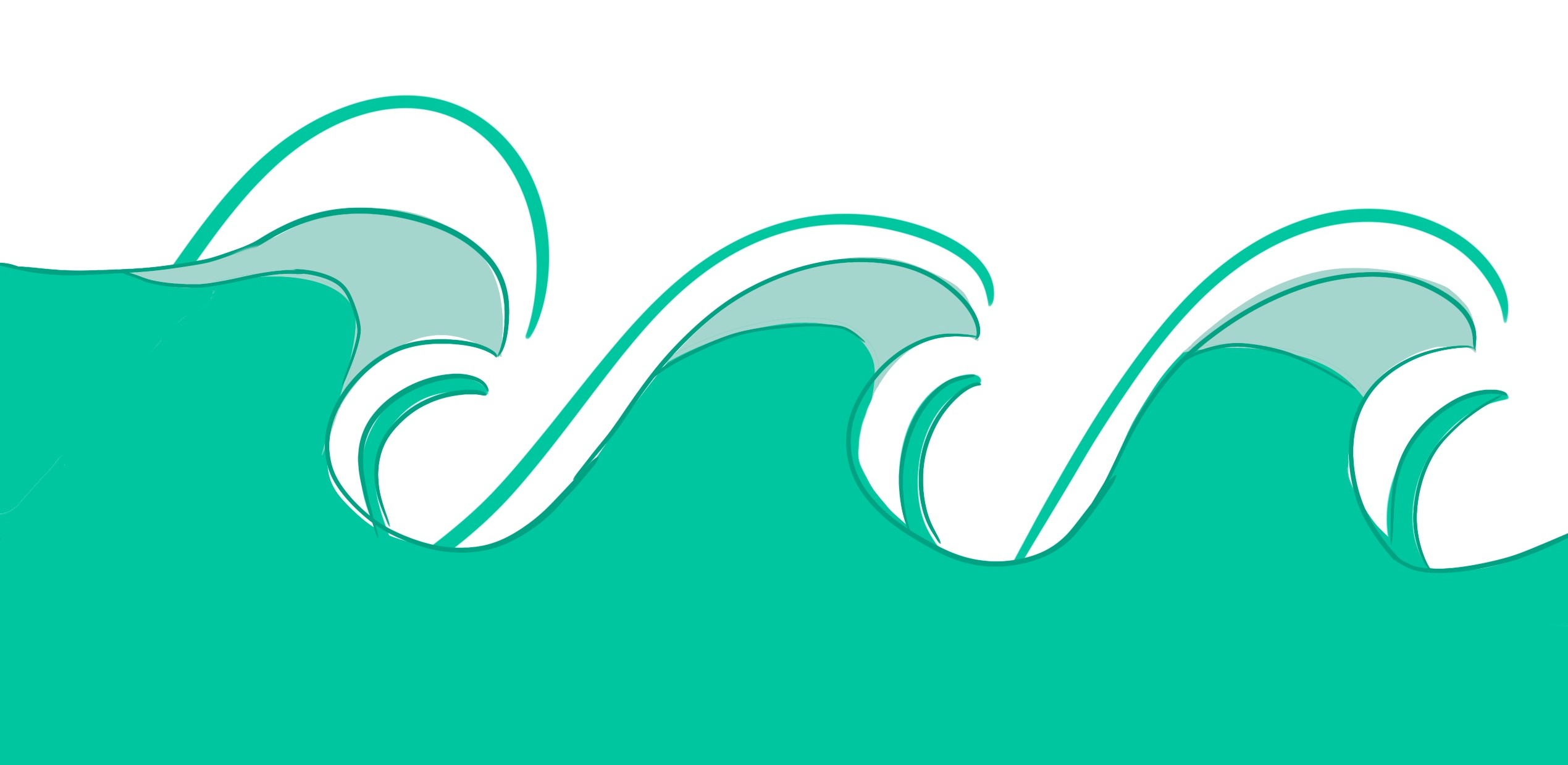
Hazy IPA
These three labels were made to represent the flavour that they possess. The Smooth Lager is a flowing motion on a hill using a navy blue which is representative of most brand lagers, something that is recogniseable and provides trustworthiness in terms of flavour. The Somers Ale is in a Beachy sunset orange, showing the good times by the beach watching the sunset and drinking a good session ale. The Hazy IPA is a wavy turquoise colour, representing the constant wave of flavours that comes with a good Hazy IPA, and the good vibes that come with being with the waves.
Designing the Label
With the illustration of the labels done, now was time to move to photoshop and populate the illustration with the necessary information. Adding the logo and name of beer to each can. You'll notice below that the logo's aren't in the same place as some in the mocked up images, you can see a continual flow in the can design, a deliberate and aesthetic design.

Smooth Lager
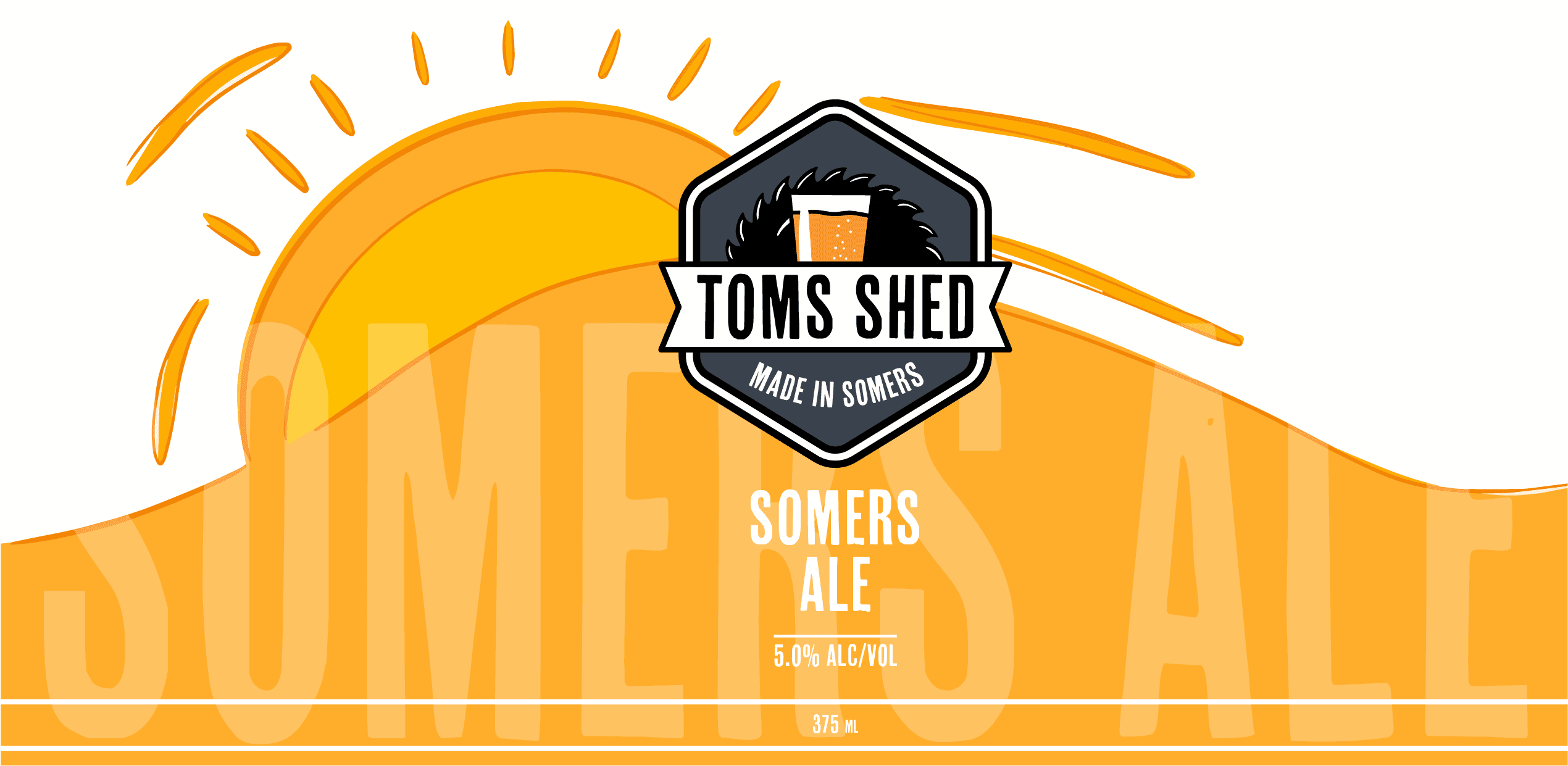
Somers Ale

Hazy IPA

Style Guide
With the Combination Mark Logo and Beer cans designed. It was time to move on to creating the style guide the style guide which you can view here.
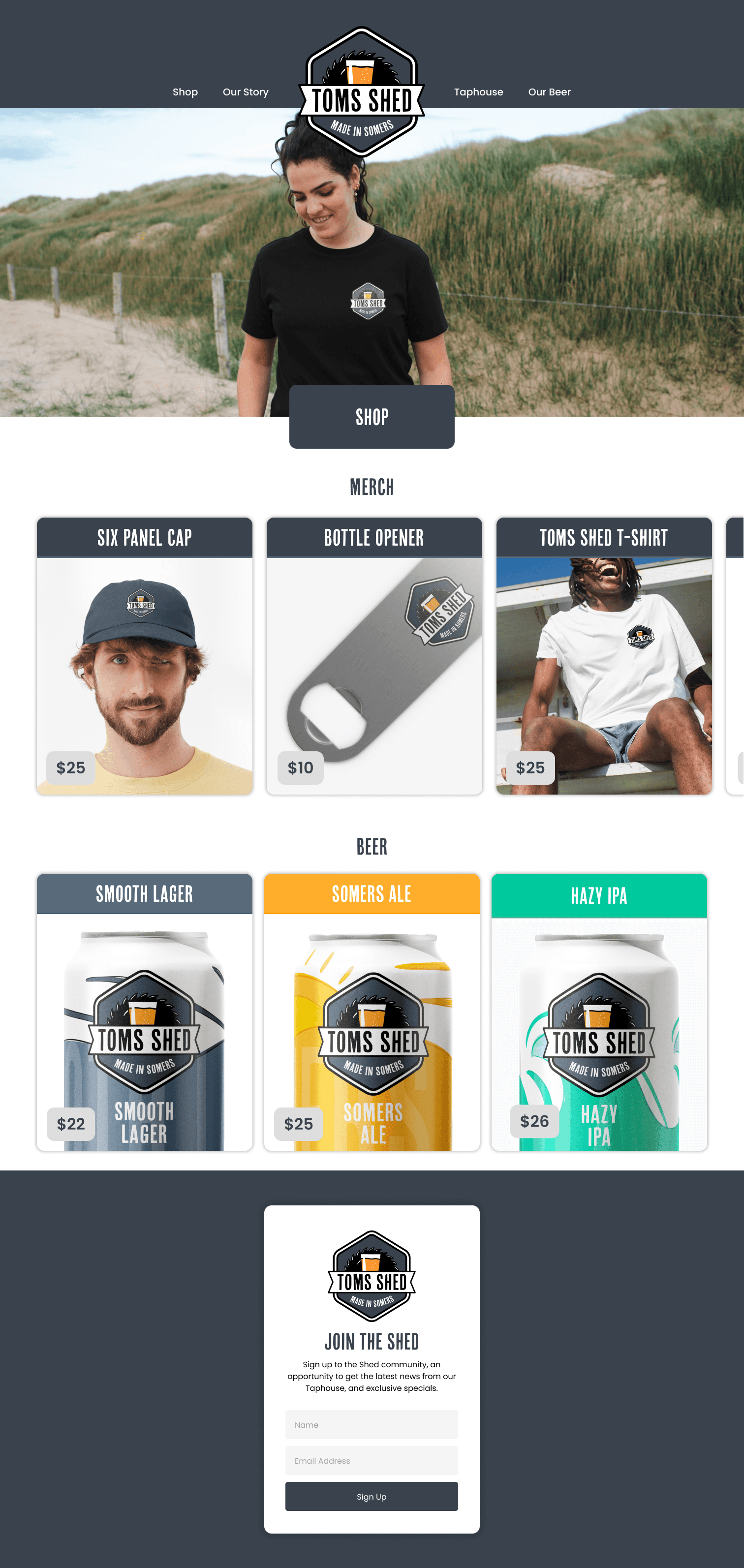
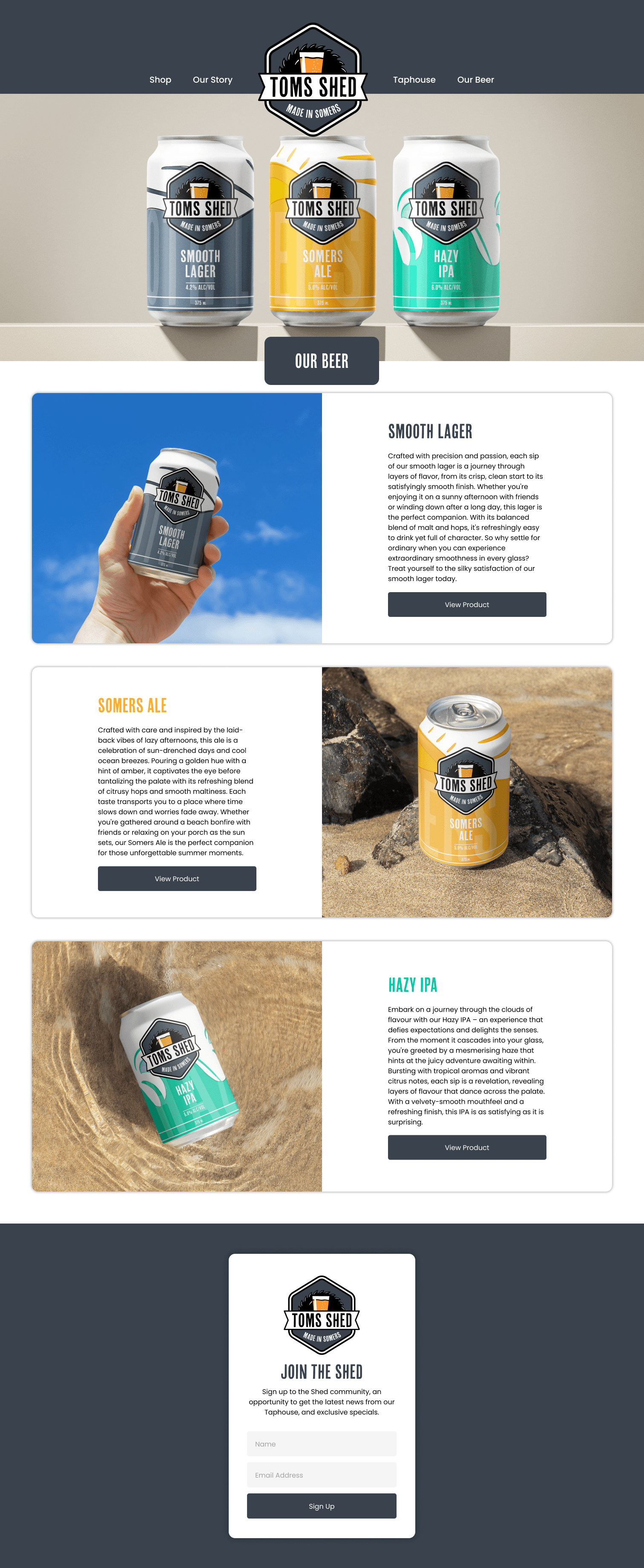
Website
Now I moved on to creating a Website for which audiences can learn more about the company, the taphouse (physical location), and order beer cans as well as merchandise from. It is the online storefront for the company, there is very important. I created a mobile and desktop version of the website. With my background in UX/UI Design, I really enjoyed creating and designing this website on Figma. You can view the prototype here.
Here are some screenshots of some pages:


Brand Extension
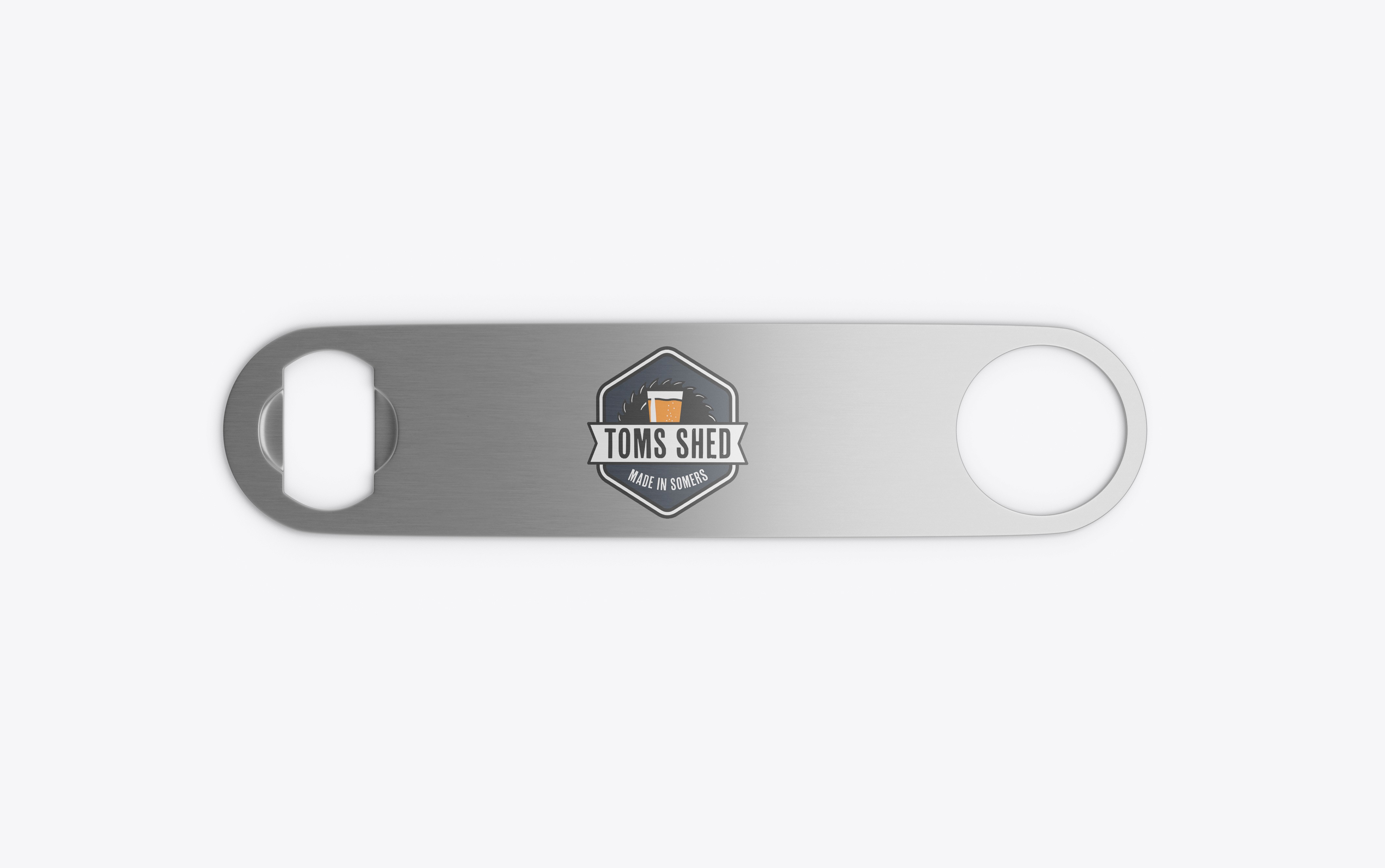
It was time to apply the logo to various merchandise and other applications which would be used to create a brand image, through research conducted, many craft beer companies create their own merchandise for fans of their beer which has often become a trendy look especially in Melbourne.
As laid out in the scope this was only possible if time was permitted and I had enough time to create these brand extensions. See below:


Reflection
Reflecting on this project that I completed, I was overall fairly happy with the final product that I had produced, as was Don who liked the logo and the product line of beers. I was proud of the website, as it helped develop my software skills with Figma. Designing the logo furthered my skills in the development stages of creating a new logo from scratch, as well as using Illustrator.
Things that require work would be time management, perhaps I spent time on certain things longer than they needed to which left little time for other important things. Although I finished everything that needed to be done, I was also tied down with other commitments such as an internship which took away time from this project, this is a reality of being at university.